Split Buttons
Use SplitButton to show Order methods in one button with a menu.
Show Post as the main action for a draft and Undo post after posting.
The draft Order menu shows Post and Change note. Undo post is unavailable, so Core hides it.
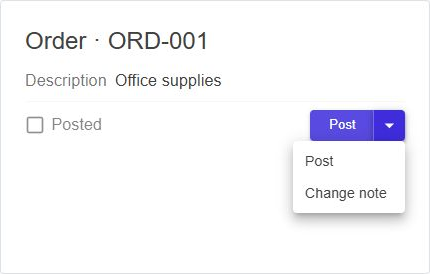
See the complete Order example for the model and page setup.
Use graph methods
Add methods to an Actions group in OrderGraph:
public static GraphBuilder Build() => new GraphBuilder("DocsOrder")
    .Property("DocNumber")
    .Property("IsPosted")
    .Property("PrimaryAction")
    .Group("Actions", group => group
        .Method("Post")
        .Method("ChangeNote")
        .Method("UndoPost"));
Use the group name as Path inside a DataGraph:
<DataGraph Builder="OrderGraph.Build" DataSet="@dataSet" EntityGuid="@guid">
    <SplitButton Path="Actions" />
</DataGraph>
The first available method becomes the main action. The menu follows the order in the group. It skips properties and child groups. Core hides methods the user cannot run, including methods disabled by the server.
| Available actions | Display |
|---|---|
| None | Nothing |
| One | Regular button |
| Several | Main button and menu |
Core uses the server label, or the method name if no label exists.
MethodButton shows disabled methods. SplitButton hides them.
Choose the main action
Use DefaultMethodProperty to let the server choose the main action:
<SplitButton Path="Actions" DefaultMethodProperty="PrimaryAction" />
The server computes PrimaryAction as "Post" for a draft and "UndoPost" after posting:
order.Compute(o => o.PrimaryAction)
    .From(o => o.IsPosted ? nameof(DocsOrder.UndoPost) : nameof(DocsOrder.Post))
    .DirtyBy(o => o.IsPosted);
Declare PrimaryAction as a virtual text property without a setter.
Load it with .Property("PrimaryAction") in the graph.
See the entity declaration.
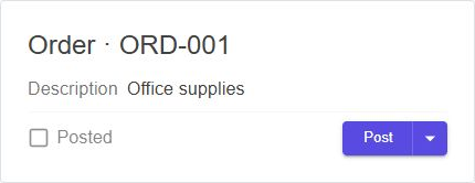
Draft Order: Post is the main action.
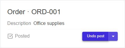
Posted Order: Undo post becomes the main action.
Matching ignores case. Empty, unknown, or unavailable names use the first available method.
PrimaryAction changes update the button. Menu selection does not change PrimaryAction.
Handle actions
The dataset runs methods without parameters on the current record, including workflow dialogs. Read uses GET; Modify uses POST.
| Callback | Behavior |
|---|---|
OnButtonClick |
Replaces the main button's automatic call. |
OnItemSelected |
Replaces a menu action's automatic call. |
OnInvoked |
Receives the server response when Core runs the method, including errors. |
OnButtonClick and OnItemSelected receive the exact server method name.
Use them for parameters, static methods, or custom workflow behavior.
After a successful Modify call, Core updates or reloads data before calling OnInvoked.
The button and menu stay busy while a method runs.
See reload failures and retries.
Messages are automatic even when OnInvoked is set.
Use MessageHandling="MethodMessageHandling.Manual" when the callback displays them itself.
In a custom click handler, set message handling on the dataset call.
See messages.
Supply your own actions
Omit Path to supply labels and handle clicks yourself. A DataGraph is not required.
<SplitButton InitialText="Post"
             MenuItems="@actions"
             OnButtonClick="RunActionAsync"
             OnItemSelected="RunActionAsync"
             ControlVariant="Variant.Filled" />

@code {
    private List<string> actions = ["Post", "Undo post"];
}
Define RunActionAsync(string action) to handle the selected label.
Menu selection changes the main text unless KeepPrimaryAction="true".
An empty InitialText uses the first label.
Use MenuItemOptions for icons and dividers:
private IReadOnlyList<SplitButtonMenuItem> actions =
[
    new("Post", Icons.Material.Filled.Check),
    new("Undo post", Icons.Material.Filled.Undo, DividerBefore: true)
];
A nonempty MenuItemOptions takes priority over MenuItems.
State and appearance
ButtonDisableddisables the main button.MenuDisableddisables the dropdown.IsLoadingdisables both and showsLoadingTextwith progress.StartIconadds a main-button icon.ControlColor,ControlVariant,ControlSize, andMenuWidthcontrol appearance.ButtonAriaLabel,MenuAriaLabel, andLoadingAriaLabelprovide accessible labels.
See also
- Method Buttons
- Client Property Groups — arrange fields and actions.